Hellen Keller Services:
Tactile Navigation Aid
ContextDuring my graduate studies at NYU, my team and I encountered a significant challenge in navigating fire exits faced by blind and low-vision employees at the Hellen Keller Services for the Blind (HKS) office in Brooklyn. HKS offers a wide range of services and programs for people who are blind or have vision impairments.
This issue initiated an academic project focused on enhancing the accessibility of the office environment and fostering confidence and familiarity for those who rely on tactile cues for way-finding.
My Roles & ResponsibilitiesProduct Designer (Physical Fabrication)
TeamN. Yang
J. Zhang
Project StatusTested at Hellen Keller Services, Brooklyn Office
Timeline2 Months (Mar - May, 2024)
Key ChallengesCurrent Exit Signs
Existing exit signs are mounted high on walls and only rely on illumination, making them almost impossible to locate for people with low vision or blindness.
Navigational Arrows
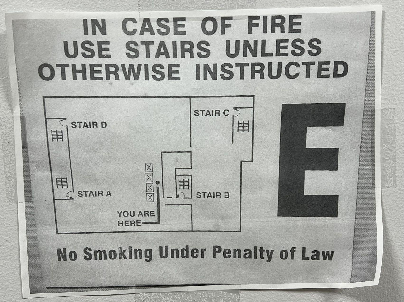
Current arrows on the floor lack clarity, don't provide effective directional or tactile guidance, and utilize inaccessible colors (red/green).
Map
Printed office map is inaccessible as it does not provide any tactile elements.
How Might We QuestionHow might we design accessible navigational aids for the Hellen Keller Services office that empower employees with low vision or blindness to confidently and independently navigate the workspace, particularly in locating fire exits?
Research
“When entering a new building, I will ask for assistance to orient the space. I don't have the time or patience to explore on my own.”
— HKS Employee with loW vision “About the emergency exits at HKS, I know where they were based on the fire drill, and I feel confident navigating to two of them. I don't know what markings there are…”
— BLIND HKS Employee“The Brooklyn office is quite large and complicated. Having some sort of tactile navigation would definitely be helpful.”
— BLIND HKS EmployeeDesign Process
Initial map Prototype & Testing InsightsDurability Concerns & Lack of Signifiers
The use of cardboard as a material is too fragile and breaks at the slightest touch. Users found the layout to be quite difficult to distinguish by touch and requested landmarks such as a “You are Here” point.
Initial Exit Sign Prototype & Testing InsightsPreference of Raised Letters
During testing, triangles were the easiest shape to help quickly identify direction. Raised letters are reportedly easier to read than concave or engraved letters. The iconography of a person and staircase was considered redundant and hard to identify.
Final Asset DesignHigh Contrast & Simple
Constructed from a combination of high-contrast acrylic and 3D printed elements, these signs explore various shapes and textures to ensure easy identification by touch. The typeface used in our navigation aids is Helvetica, an ADA-approved font suitable for both visual and tactile reading.
Product AssemblyFinal Product
This video outlines the research and design process of the Tactile Navigation for Hellen Keller Services project. The video includes audio descriptions and closed captions.
What I LearnedIntentionality is not a Given
Working on this project emphasized the fact that advocating for accessibility is never a given, not even at an organization such as Hellen Keller Services, that specializes in providing accessibility services.
Lived Experience Cannot be Assumed
Being able to interview and do user testing with HKS employees who have lived experience as people with low vision or blindness was pivotal to the success of this product. This experience became yet another reason as to why I will always push for having users with lived experiences of disability included in the research process.
Laser Cutting Braille
Laser cutting Braille proved challenging, as the small dots often fell through the cutter bed. To overcome this, I figured out a technique of multiple cuts per word and the use of tape to ensure the Braille remained intact.


